Posts

GIS 6005 - Proportional Symbol and Bivariate Choropleth Mapping
Image
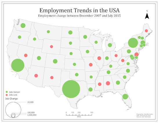
 While there are many ways to display data on a map, proportional symbol and bivariate choropleth mapping can be considered two methods that are technically challenging but significantly beneficial when executed correctly. The challenges proportional symbol maps can introduce include, but is not limited to, overlapping symbols, symbols that do not have enough variation in size, and accurately displaying positive and negative values. One of the maps created for this week's lab, as seen below, is an example of a proportional symbol map that has both positive and negative values. To properly display both sets of values, the GIS professional has to create additional attribute fields that separate the positive and negative values, followed by making the negative values positive. Once this is done. The data can be symbolized and displayed effectively.  Alternatively, bivariate choropleth mapping involves showing the relationship between two data variables. This is particularly beneficial

GIS 6005 - Analytical Data

Image
When we think about using GIS to communicate information it can often be done with a single map. However, we often require additional 'help' relaying that information. This help can be in the form statistics and various graphs, which are derived from analysis of raw data. When the supplemental statistics and graphs are, then, combined with a map or multiple maps we create an infographic. The task for students this week was to create our own infographic that includes two maps, multiple charts and statistics stated in text format. The infographic I created highlights the relationship between smoking and reports of fair or poor health.  To create this infographic, data from County Health Rankings was combined with existing county GIS data to create two choropleth maps. The first map displays the percentage of adult smokers by county and the second map shows the percentage of adults that reported their health to be fair or poor. The maps are accompanied by two pie charts, a scatter

GIS 6005 - Color Concepts and Choropleth Mapping

Image
 Module 4 of Communicating GIS took students on a journey of color. This week we learned the extent at which color impacts a map and the information being communicated. We have had to take into consideration which colors usually or best represent specific types of data, how the human eyes interpret color, how colors interact with each other, and the ways color can vary in hue, saturation and lightness of value. While we focused on the RGB and HSV color systems, we also explored displaying quantitative data and using color ramps to symbolize sequential and divergent data.  The following images show three color ramps. All of the color ramps were created using the RGB color system, however, each was created utilizing a different method. The first ramp was created by choosing the darkest and lightest hues, followed by determining the 4 shades in between at an equal interval. The second ramp utilized the same darkest and lightest hue, but the 4 shades in between were determines using interv

GIS 6005 - Terrain Visualization

Image
 As indicated in the title of this blog post, Terrain Visualization was the topic for this week's module. This means that we primarily focused on utilizing various types of elevation data, including raster based Digital Elevation Models (DEMs), contours and Triangular Irregular Networks (TINs), to understand the terrain or the 'lay of the land'. This was supplemented by introducing techniques to better display elevation data such as creating a regular or multidirectional hillshade and masking contour labels. The following landcover map is an example of one of the products produced during this week's lab.  To better visualize Yellowstone National Park, I utilized a multidirectional hillshade under the landcover layer displayed at 50 percent transparency. This gives the map reader a better understanding of the various elevations and which types of land cover can be found at those elevations. The colors used for the various types of landcover generally match the landcover

GIS 6005 - Coordinate Systems

Image
Week 2 of GIS 6005 focused on Coordinate Systems. At this stage, coordinate systems are something that almost all GIS students are aware of, however, this module went into great detail. We went back to the basics, learning about the earth and earth coordinates, followed by getting a deeper understanding of scale, how it can be calculated and how it can be determined if the scale of a map is unknown. Lastly, we dove into projections, gaining an understanding of the various projections and their properties, including when they are most and least appropriate. As a result, we were tasked with deciding on an appropriate coordinate system for an area of interest of our choice. I chose the US state Tennessee.  Map of Tennessee, USA, The coordinate system I felt was best suited for Tennessee is NAD 1983 StatePlane Tennessee FIPS 4100 (US Feet). This projection is the most accurate projection for the State that encompasses the entire state. This meant that I did not have to choose a projection

GIS 6005 - Map Design and Typography

Image
 For the first week of the course Communicating GIS (GIS 6005) we were tasked with learning about map design, including the five map design principles, and typography, including the various fonts, colors and sizes suitable for various labeling purposes. This post will focus on the five design principles, which can be seen in the map below.  The following are the design principles and how they were applied: 1. Visual Contrast – This map used a fairly bright orange color to represent the recreation centers which contrasted with the muted green color of Travis County. The use of a rich green color for the golf courses and bright blue for the waterways also added contrast.  2. Legibility – Firstly, the symbol for the recreation centers is a circle, which is easily noticed, distinguished and read by the map user. This map also contains labels for the streets. As the map is fairly small the labels needed to be small enough that they did not detract from the main features of the map but large

GIS 5935 - Scale Effect and Spatial Data Aggregation

Image
As seen in the title, this week's module and lab covered two topics. The first topic was scale effect. In a world where we have various interactive maps at the palm of our hand, scale effect may not have the most blatantly obvious issue with viewing data. However, scale effect can have a wide-ranging impact on data we are using and collecting. Vector data, for example, created from imagery or raster data is only as good as the finest detail that can be seen. This means at a small scale the resolution is considered low and small features and intricacies are not visible. Larger features are the only items detectable or discernable. As such, fewer vertices and segments are used to represent a feature, which can lead to less accurate calculations that tend to have a smaller numerical account of the feature. The opposite is true for large scales.  The second topic covered this week was spatial data aggregation. This refers to the combining of data into a boundary, which in turn generali