GIS 6005 - Map Design and Typography
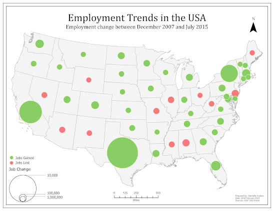
For the first week of the course Communicating GIS (GIS 6005) we were tasked with learning about map design, including the five map design principles, and typography, including the various fonts, colors and sizes suitable for various labeling purposes. This post will focus on the five design principles, which can be seen in the map below.

1. Visual Contrast – This map used a fairly bright orange color to represent the recreation centers which contrasted with the muted green color of Travis County. The use of a rich green color for the golf courses and bright blue for the waterways also added contrast.
2. Legibility – Firstly, the symbol for the recreation centers is a circle, which is easily noticed, distinguished and read by the map user. This map also contains labels for the streets. As the map is fairly small the labels needed to be small enough that they did not detract from the main features of the map but large enough to read. To assist with the legibility of the labels a small size sans serif font with a white halo was used. This helps with the legibility of the label without it being too large.
3. Figure-Ground Organization – The Travis County polygon is outlined with a black border that helps it to stand out as the focal area on the page.
4. Hierarchical Organization – Travis County is centered in the middle of the page with attractive colors that initially draw the map readers eyes to the center. The title is the second largest element, followed by the legend, scale bar and north arrow, and draws attention in that order based on size and position. Lastly, the supplemental information is in a smaller font near the bottom right corner which would be the last place the eyes are drawn to.
5. Balance – Initially, some of the additional map elements, such as the legend, scale bar and supplementary information, were hugging the border which left a lot of white space between those elements and Travis County. Upon review, they were moved away from the border a bit which then helped to balance the page more, giving the impression of less white space.


Comments
Post a Comment